Interpreting a Graph
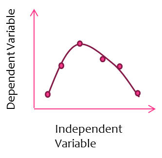
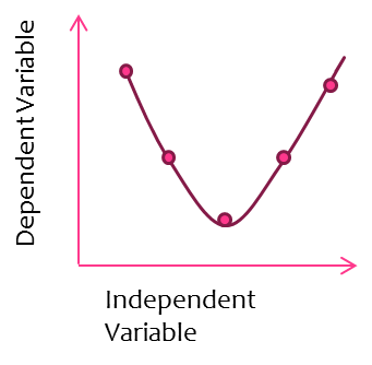
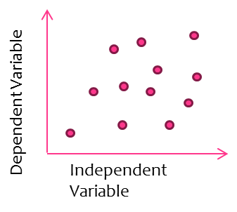
*Interpreting a graph begins with looking for patterns or trends in the data points. Is there a general upward trend of the points? Or is the trend downward? Do the points go up and then level off? Or do they gradually increase, reach a peak, and then gradually decrease?
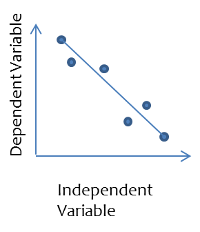
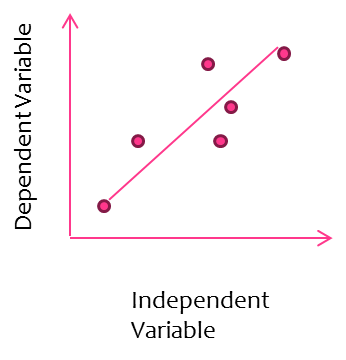
* *After the trend or pattern of the data points is identified is when you draw a line that Best shows that trend. It’s not just a zigzag line that just connects all the points, but a line that is drawn to show the general trend of the data. It’s called the Line of Best Fit.
* *After the trend or pattern of the data points is identified is when you draw a line that Best shows that trend. It’s not just a zigzag line that just connects all the points, but a line that is drawn to show the general trend of the data. It’s called the Line of Best Fit.
|
*The line should be a straight line or a smooth curve and NOT a zigzag line. This is how the line illustrates trends in the data. *Draw the line so that about half the points are on one side of the line and half are on the other side. Some points may be on the line. The resulting line represents an average of the data. |
|
|
|
*Now that you know how to draw a line-of-best-fit you need to learn how to write a statement that describes the relationship between the variables on a graph. *The statement should summarize the relationship between the independent (manipulated) and dependent (responding) variables. *One procedure for describing the relationship between variables on a graph uses the following format:
As the ______________ ___________________, (Independent variable) (describe how it was changed). The _________________ __________________. (dependent variable) (describe how it changed) Using this format, a statement of relationship between variables might be written: As the length of time water was heated increased, the temperature increased. IV how it was changed DV - how it changed
|

